A gallery of pictures of the best and worst examples of handwriting I found in archives

Here is an excellent example of Italian cursive handwriting used in the 20th century.
Corbetta, parish registers, Deaths, 1932
It was the only concession among the many obligations and rules.
Eventually, this Officer of Civil Status was a creative mind and carved a sort of forked point on his quill, so that a thin line followed the same trace as the main one. Very artistic, for a town hall clerk!
Year 1893, Manta (province of Cuneo)
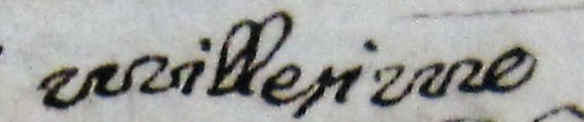
I am not sure if it is very practical to write the M and N like a snake,
but the final effect is… hypnotic!
(the enhanced word is millesimo)
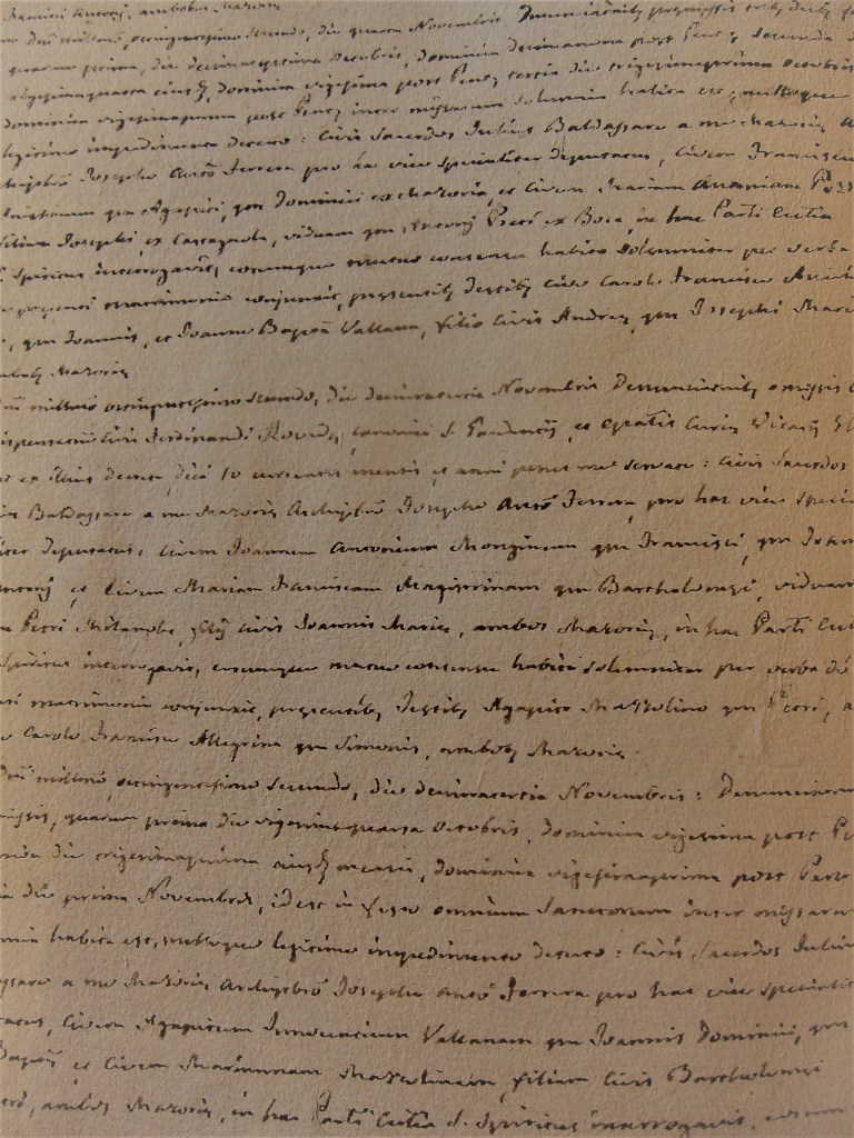
Year 1829, Gambolò, province of Pavia, shot at the parish archive

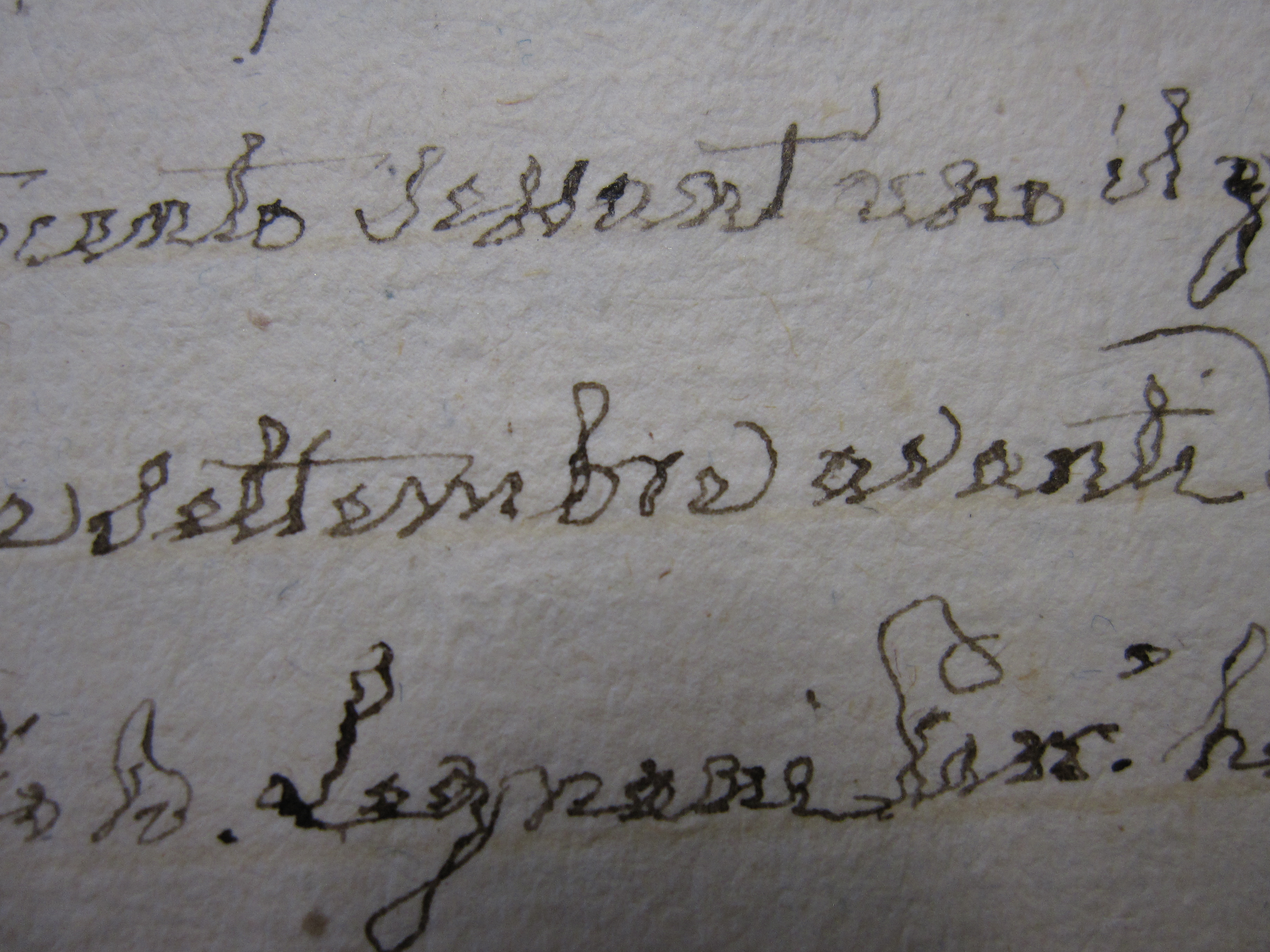
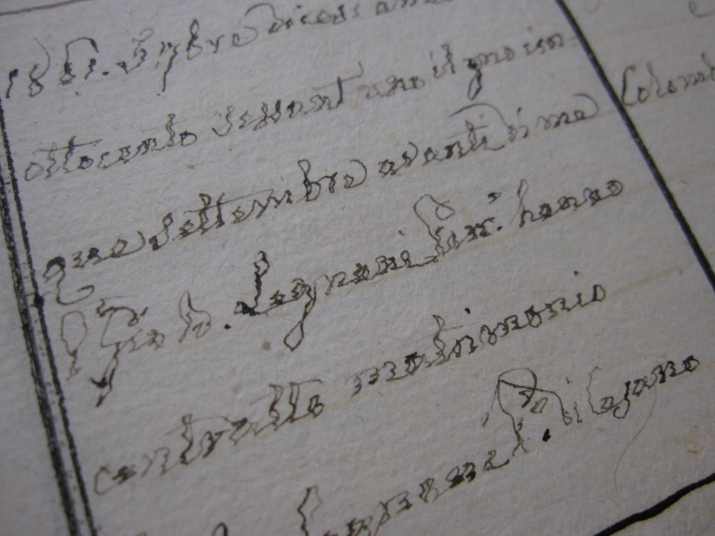
The poor priests of the past centuries used quills that they usually made by themselves, they did not have eyeglasses and were working at candle light.
In this example, the poor, old priest eventually had some sort of disease, perhaps Parkinson, but he kept on stoically recording baptisms, marriages and deaths despite the effort.
Year 1815, Castelnuovo Scrivia, province of Alessandria – shot at the parish archive
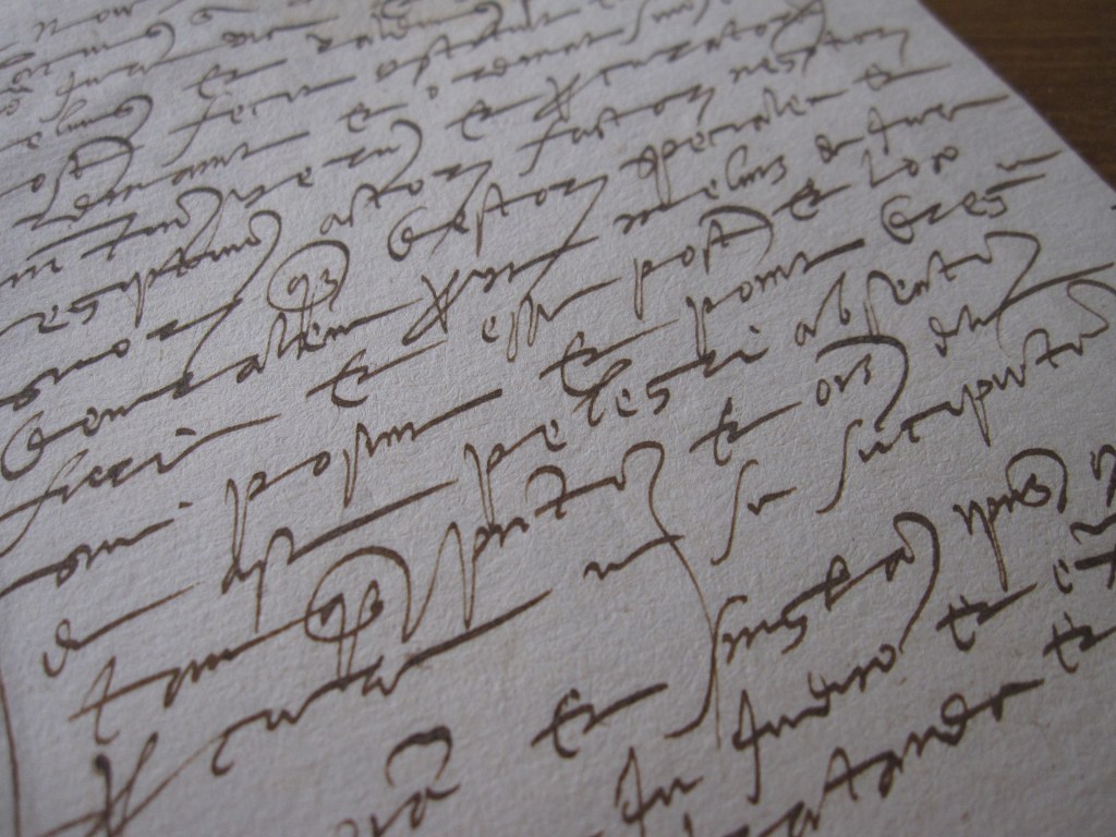
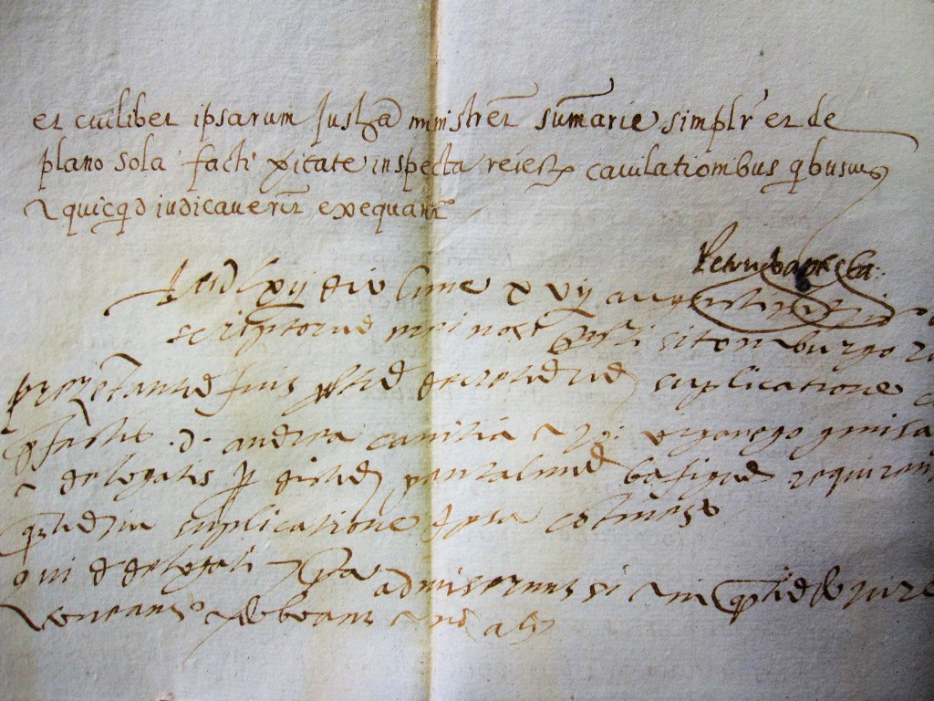
Year 1551, Rapallo, province of Genova – shot at the Genova State Archive
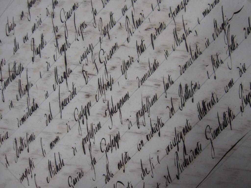
The letter “s” is written as a descending letter
(see the name Giuseppe Alfonso and the word “professione”)
Year 1851, Mioglia, province of Savona – shot at the Diocese Archive in Acqui Terme
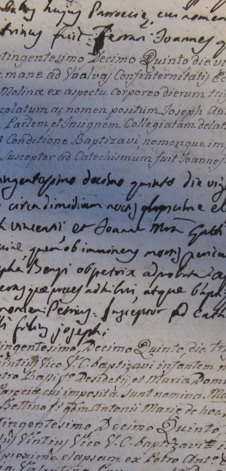
Well it wasn’t an easy job, indeed. This tiny, monotonous, hardly readable handwriting in Latin was a challenge, at first, but then I got used to it.
Year 1802, Maggiora, province of Novara – shot at the parish archive
I think it looks very modern compared to the typical cursive handwriting of that period.
The month of this records is December and if you have doubts about it,
check my article:
https://egancestryresearch.com/2020/03/16/why-8-means-october-and-not-august/
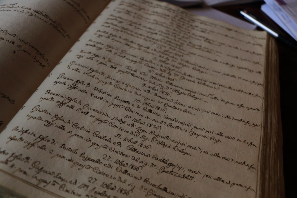
Year 1836, Lusiana, province of Vicenza – shot at the parish archive
Did handwritings change in time?
Were people writing in a more/less tidy way in the past centuries?
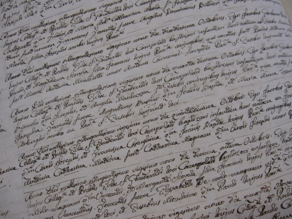
This shot is perhaps the best example I found to reply “IT DEPENDS” to all questions above.
In the same page of a notary’s deed dated 1562, an elegant, very readable example of calligraphy is followed by a completely different handwriting which is far less readable.
Year 1562, Rapallo, province of Genova – shot at the Genova State Archive
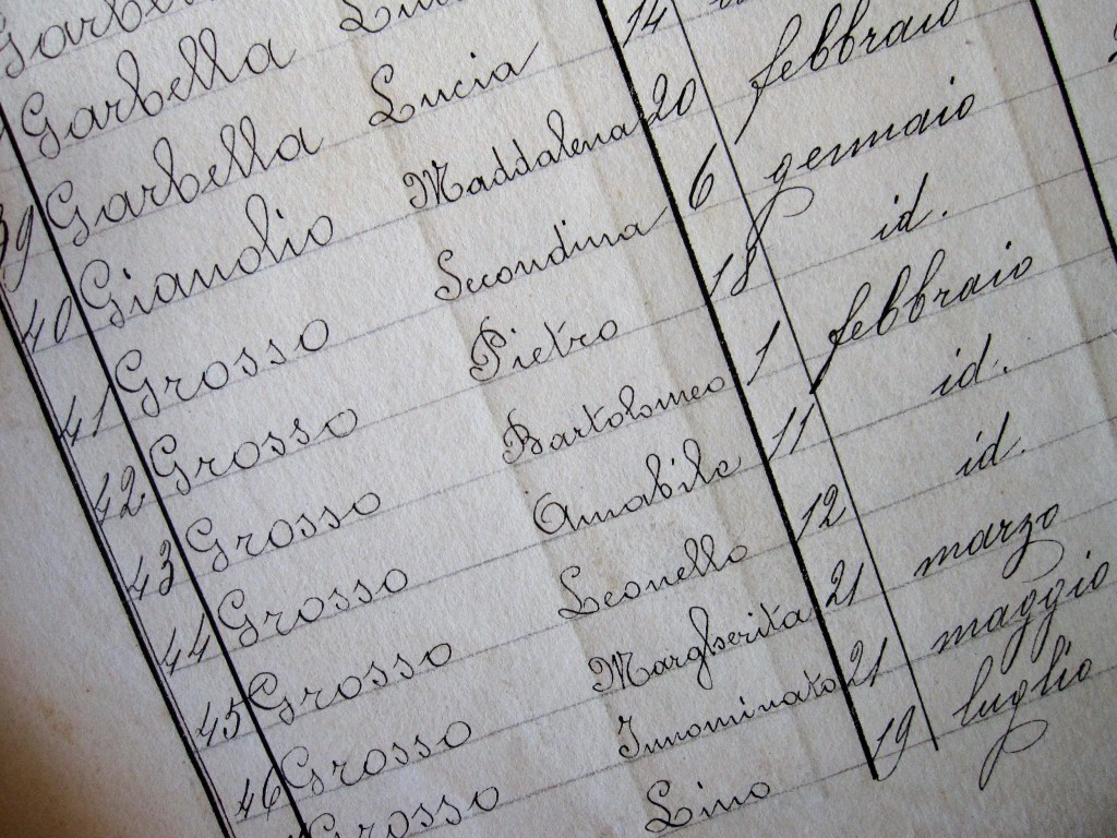
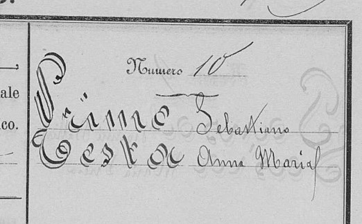
Look at this amazing index of a register of deaths: the clerk used a big font for surnames, a smaller one for given names and an inclined handwriting for progressive numbers and dates.
The art of writing in different styles was taught in schools for as long as the middle of 20th century.
By the way, this clerk was so tidy that he also folded the sheet vertically to create a “line” where he should start writing the names, you can still see the fold.
Year 1885-1892, Mosso Santa Maria, province of Biella – shot at the parish archive
